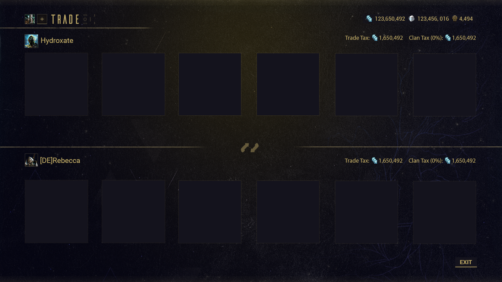
WARFRAME TRADING UI
Warframe’s trading process allowed players to trade 5 items from their inventories at the clan dojo.
The initial process was:
Select Available Player
Select a trade slot
Select Category of Item
Search for item in inventory
Confirm Item
Select Ready
Wait for Other Player to confirm
Complete trade
Now the major friction with this process was that step 2 - 5 was repeated for each item the player wished to trade. This meant that for a 5 item trade, it would take at least 15 steps across 3 windows to get the items ready to trade in a perfect scenario with no misclicks or changes of the other player. This was a time sink a lot of players did not like.
The redesign was to tackle this and make it much more streamlined, and to look at other queries / QoL items that could also included.
Tracking Forum threads of trading problems.
The design was to keep the inventory feel the players were used to. Item selection and categorisation would stay in the same window so that the players could quickly search and select before offering the items. Below is the progress of UI designs for each stage of the trading process.


Available PLAYERS
The first design was to reskin the current window. Then from there exploration of looking at the player at the actual trading kiosk to give it a sense of action and overlaid player list was done.
From here the information of what the players see was explored, the trades the other player can do is important as it relies on their Mastery Rank (Player Level). Obviously the Name is important for identification as it should match the chat name they have started with the other player prior. A dropdown was explored to see about minimalisation of onscreen info.
Other items that were to appear here were the trade button and clan tax button and these were explored between default button style and special button style.
The seventh iteration was agreed on (last image on slideshow).


INITIAL SCREEN
The first screen after selecting the other player. I wanted to explore other ways than a reskinned version first to show the interaction between the two players. Players go through a lot of effort on their customisation and would be interesting to show this off in a visual show of the social interaction thats happening.
Eventually the reskin was settled for but an increase of items from 5 to 6 as certain sets of items since the initial system came out have increased from 5 items for a complete set to 6 and using a new trade for a single extra item seemed extra and unnecessary since the players have a limit to their trades per day and this was requested from the forums.


CATEGORY SELECT
Initially there was over 12 categories of items, Platinum was unique in that it opened a dialog for the player to select the amount of the currency they wished to trade.
Initially I explored putting the categories inside the inventory search to prevent players from having to switch between the offer page and categories each time. From here the categories were narrowed to the main types the inventory screen could support which were items / mods / platinum. Inside each of the inventory screens we could use the existing categories and filters the players were used to so not needed at the higher level.


INVENTORY BROWSING
Here you can see the upgrade in fidelity of my mockups from getting setup in photoshop and getting the style guides and it being used for the selection / search process.


FINAL OFFER SCREEN
Since the offer screen was decided for initial screen, the design was kept here, also added verification of companion blueprints and readded verification of sets just in case the other player was not being just.
