VIAFREE APPLE TV APP REDESIGN

MOCKUP


VIAFREE ON THE APPLE TV
The Apple TV app was not updated since it’s launch over 2 years prior, and I was tasked with the redesign to bring it up to modern standards for a streaming experience.
Some problems were apparent for the application:
Most of the content images for main sections were small and hard to see or cropped.
The UI was using a lot of white negative space which for a relaxed streaming experience on a TV is not recommended.
The UI’s focus states were harsh and clunky
Information on episodes and series were not present for browsing.
Selection of seasons wasn’t a great experience due to horizontal scrolling, and hard to grasp at a glance the available season count.
Sports Home Page and Normal Home page didn’t use the same UI, which meant double the maintenance work and was confusing that each page used different ways to show the same information.
With this analysis, I decided that there were some things that were going to be the pillars of the redesign:
Dark and elegant UI
Informative metadata to be exposed
Contrast values for maximum readability of text.
Designed for the experience of watching from at least 2m away.
Use Apple code functionality where possible to speed up development time and maintenance.
Home Page

New Home Page
Here we have the new Home Page. It now uses dark UI so as to not blind the users in their home should they be in a dark setting, also ensuring that we have a better background to contrast font colours for maximum readability.
The cards have gotten an upgrade also. We support the publishing labels to let users now if a new season, episode, or series has been added. Contextual information is also present under the series title to let users now how often it’s added, how many seasons are available, or other promotional text the editors may want to add.
Genre Cards now have the glass effect added to provide a more colourful background to the text, removing the circle shape as this didn’t fit with the new aesthetic.
The “growing” focus state that apple uses is preserved, with ample space for the text underneath to be read. Before the drop shadow would cover the text, and this hierarchy is now fixed.
The featured items carousel now changes the background image and information present to give a grand entrance to the homepage and increase the feel that the home page is curated and visually see that it is updated often, a comment we had seen from our user tests and reports.
And the sports home page now uses the same UI!
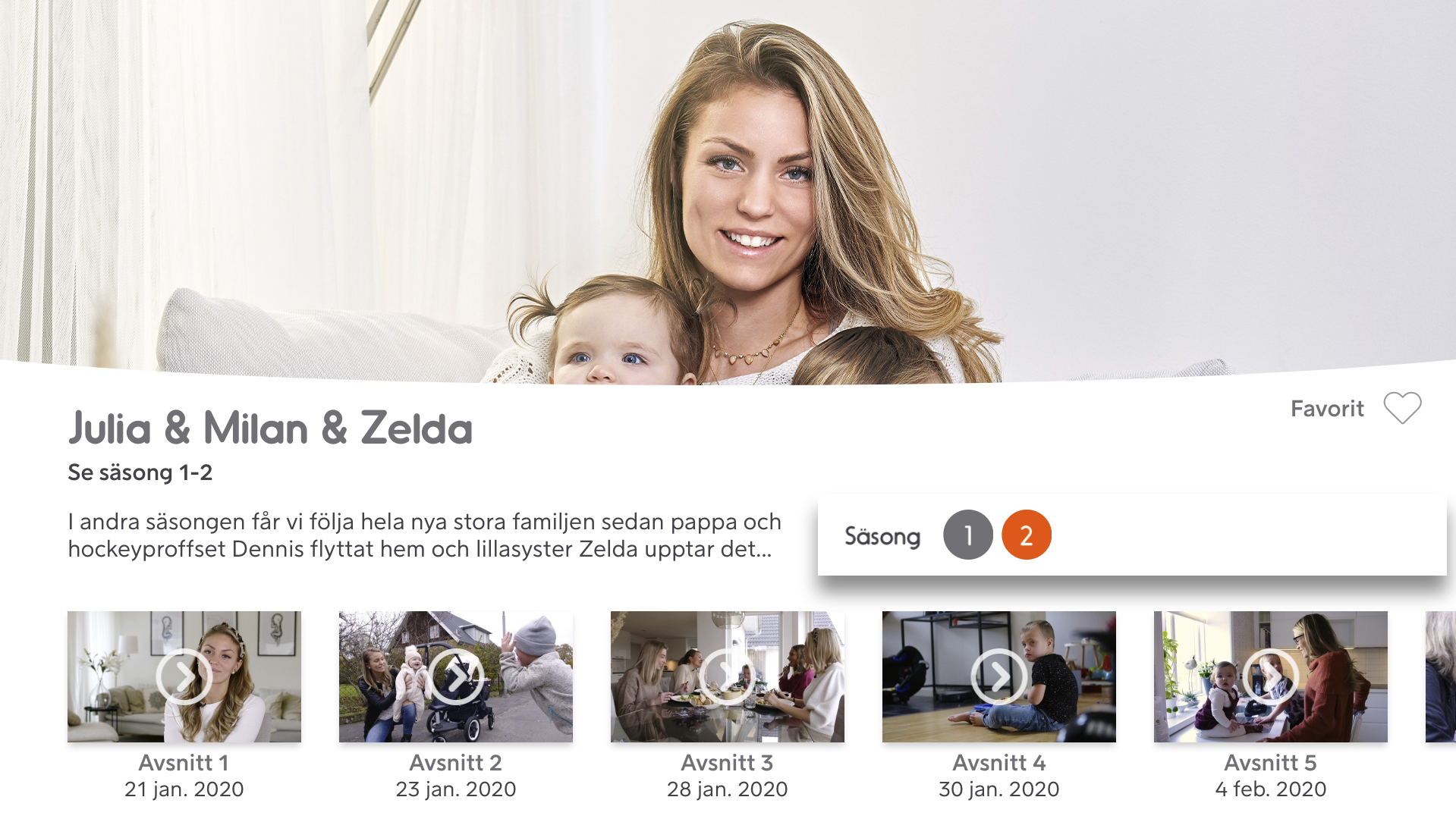
Series Page

Series Page Hero
On the series page, we wanted to show the content image as the background instead of cropping it in half. This allows the items on the hero section to have more breathing room. The gradient on top of the image allows the text to have greater contrast values and seamlessly blend it to the dark background below where the episodes are.
In the previous version, the Season Select and Favourite Functions were to the left and were clunky to use. Since we performed a A/B test and the favourite function was renamed to “Add to My List”, this was also used here.
When a user comes to the series page, the main tasks they want to perform here are
“I want to resume watching where I left off”
“I want to start watching from the start”
“I want to add this to my list for later watching”
“I want to change season”
This is why the hero area has the main information about the series, and the functions that the user cant interact with. Scrolling down, they are met with the episodes section…

Series Page Episode Section
Here we see that the user also can change season, as having to scroll up to the main hero section to switch season would cause a lot of frustration. The different material thats available for this season is shown beside the season select.
The new episode Cards are shown here. They feature the length, publish date, and description of the episode as users needed this info to determine how long they could gauge their watching time, and also use the dates for live content to see when it was published. A new feature of these cards allow the users to highlight the description section and read the episode description, never before available on the app. This would generate an overlay as seen below.

Episode Information Overlay

New Season Select
The new season select also allows users to see the information on the current season they have and see all the seasons and how many episodes there are in each, great for preparing a bingefest! It is much easier to digest the information in a vertical list and glance through the seasons to see if any are not present, rather than a sea of numbers that requires more cognitive load to process.
Genre Page

The genre pages have received a similar touch up. They have the featured area for the promoted items set by content editors instead of just the entire list of content. The content grid has been updated to show the updated cards for series with proper titling of content sections.
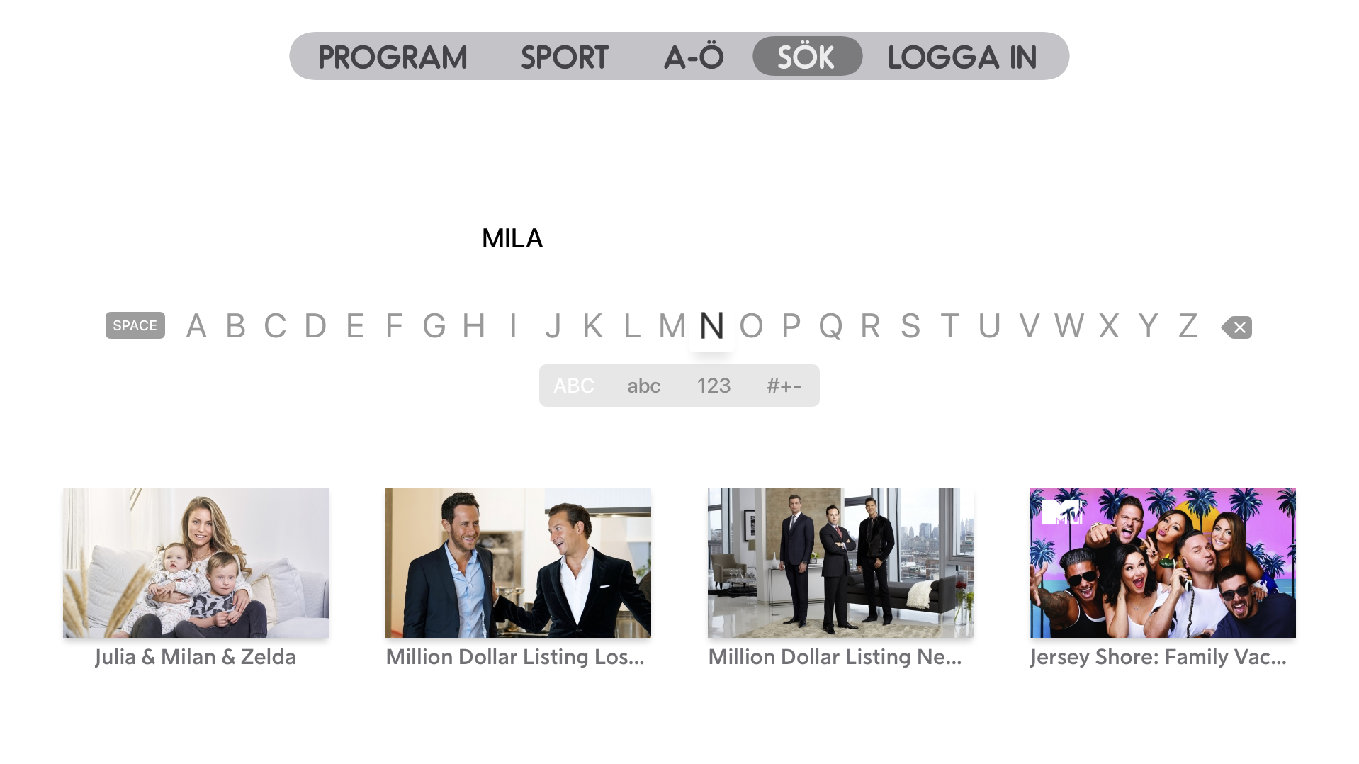
Search

New Search Page
The search page has the UI alignment similar to the previous pages for the cards and grid structure, but the real upgrade is to the search algorithm! Before the search only returned results with direct matches, any misspelling and it was a blank return. Collaborating with the back end team we looked at the feedback users had given us and their expectations of what search should be able to do. We devised using the new AWS Fuzzy Search algorithms to allow misspellings still to trigger results, and implemented genre and channel searching for content. Now users can search reality and get all their reality shows populating the results!