Warframe New User Experience Improvements
Client
Warframe - New User Experience Improvements
Year
2016
I had the pleasure of working on UX improvements for Warframe after I finished University. This was to figure out issues regarding clarity, the overall journey, and points that could reduce churn later in the game. After an analysis and watching new players play, a report of suggestions was delivered to Digital Extremes.
Here are some of the things implemented in the game:
Remove Weapon counters on UI until player unlocks their first weapons
Suggestion: Add an in-world UI to display information of the weapons.

These dialogues were updated to show more lore and hint at the damage types that each weapon provided.
Suggestion: Add item acquisition overlay when player chooses a weapon to reiterate their choice and confirm it is added to their inventory.
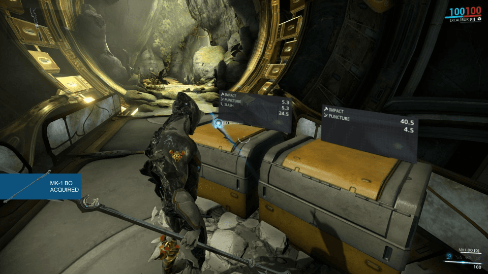
Suggestion: Incentivise the player choice by using a weapon description for both choices.
Suggestion: Add item acquisition overlay for secondary choice.
Suggestion: Add instruction to teach the player reloading is bound to R
Suggestion: Add overhead name and healthbar to containers to denote destructibility.
The player then sees two lootable lockers on their right. This would be further complimented by placing another locker beside the two that is locked. This will allow the player to learn the colour and symbolism used to denote interaction and that locked chests exist.
Onboarding hack panel was red, should align with orange as that is standard interactable interface and players should learn what to look after.

In first daily login encountered after onboarding mission, players don't know how to open. Suggestion is to add a prompt underneath saying "Click to Open"

Add Name to each offline segment to tie in to when players need to find them

When player is required to go to Navigation in Vor’s Prize, place a marker at the console. This is to prevent not knowing where to go
Suggestion: Add Small quest/tutorial to teach players how to scan after Vor’s Prize. (Silver Grove now added)
Suggestion: Terminals that cannot be interacted with are unlit. Currently all terminals are lit even when not interactable.

Suggestion: Add objective marker to the prison console for beginners quest, reiterate as seen in first mission.
Completing the ciphers will open the prison cells, eventually leading the player to Darvo. A new icon is introduced, the blue hostage / allie icon. The player may not know what this means at first and so:

Add how many players' revives are left inside the revive screen.

For sabotage missions, it's not clear what to destroy for players, add destroy markers over each destructable part rather than the object they belong to.

In Lockdowns, replace the green positive colour with pulsating orange alarm terminals to draw attention

When a player can rank up, currently no notification how to do it. Add sparkling VFX to menu button and add text “ESC” beside it for players to know how to open it up.

Add location to material tooltips and info for players to know where to farm them.
Add a acquisition overlay when players pick up a rare resource in mission to help farming intentions.
Scope of Work