Warframe Market Redesign
Client
Warframe - Market Redesign
Year
2018
The Market allows players to preview, purchase, and gift items available in game but without the waiting time of crafting. From research, a common complaint from new players was the fact that being able to craft a blueprint of a warframe instead of buying it was not clear at all. This was a major pillar of the redesign. The new market would clearly show that purchasing, crafting, and gifting are available with also information of the abilities / stats being seen clearly.
Initial Sketches
Warframe Purchase V1

I know what you’re thinking… this UI is so cluttered it’s like old WOW. I’m an avid believer of, if you have an idea for a layout, try it out and then disregard it. So here I divided the multitabbed window into two, left would be purchase and right would be crafting so that new players could clearly see the difference. I played around with the idea of the 3d warframe being in the middle so the players could see them doing their abilities which may incentivize to purchase.
Warframe Purchase V2

This version I had replaced the verbose explanations of the abilities with icons and hover tooltips.
Warframe Purchase V3
At this point after talking with other members of the UI team, I tried to follow the UI style of using tooltips for information such as crafting and purchasing as the feel of the UI is meant to be clean and minimal. The main interactions are shown on the left now with the stats underneath for quick view. I still liked the idea of the warframe doing their abilities on screen as a bit of visual fun but that lead to the next design iteration.

Warframe Purchase V4
The team wished to use the existing dioramas so the UI I was working with last time was overlayed on an exisiting diorama. The abilities would be moved to the buy tooltip as a 3d model on 2d ui proved difficult.

And an alternate layout with the info above the CTAs
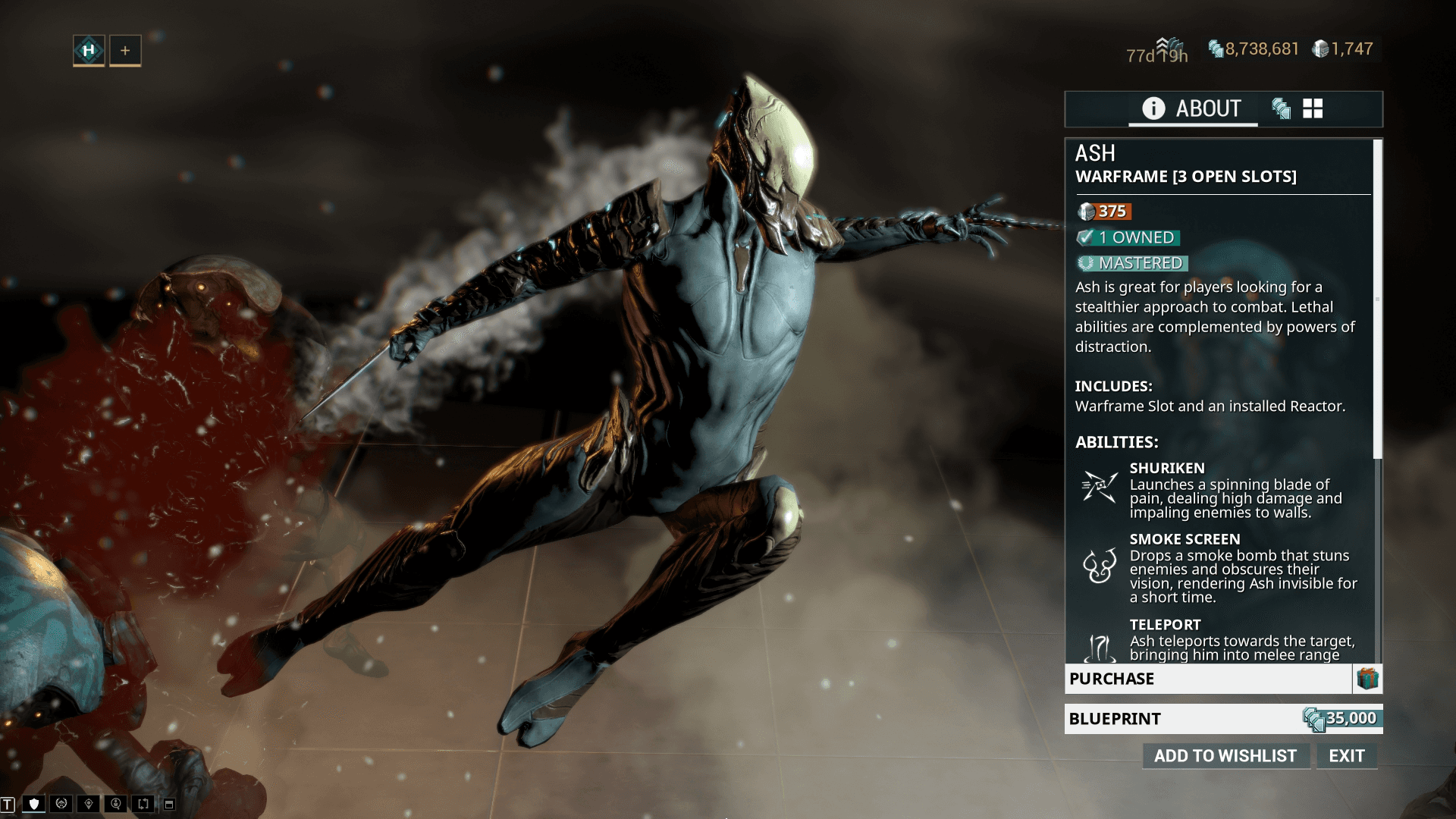
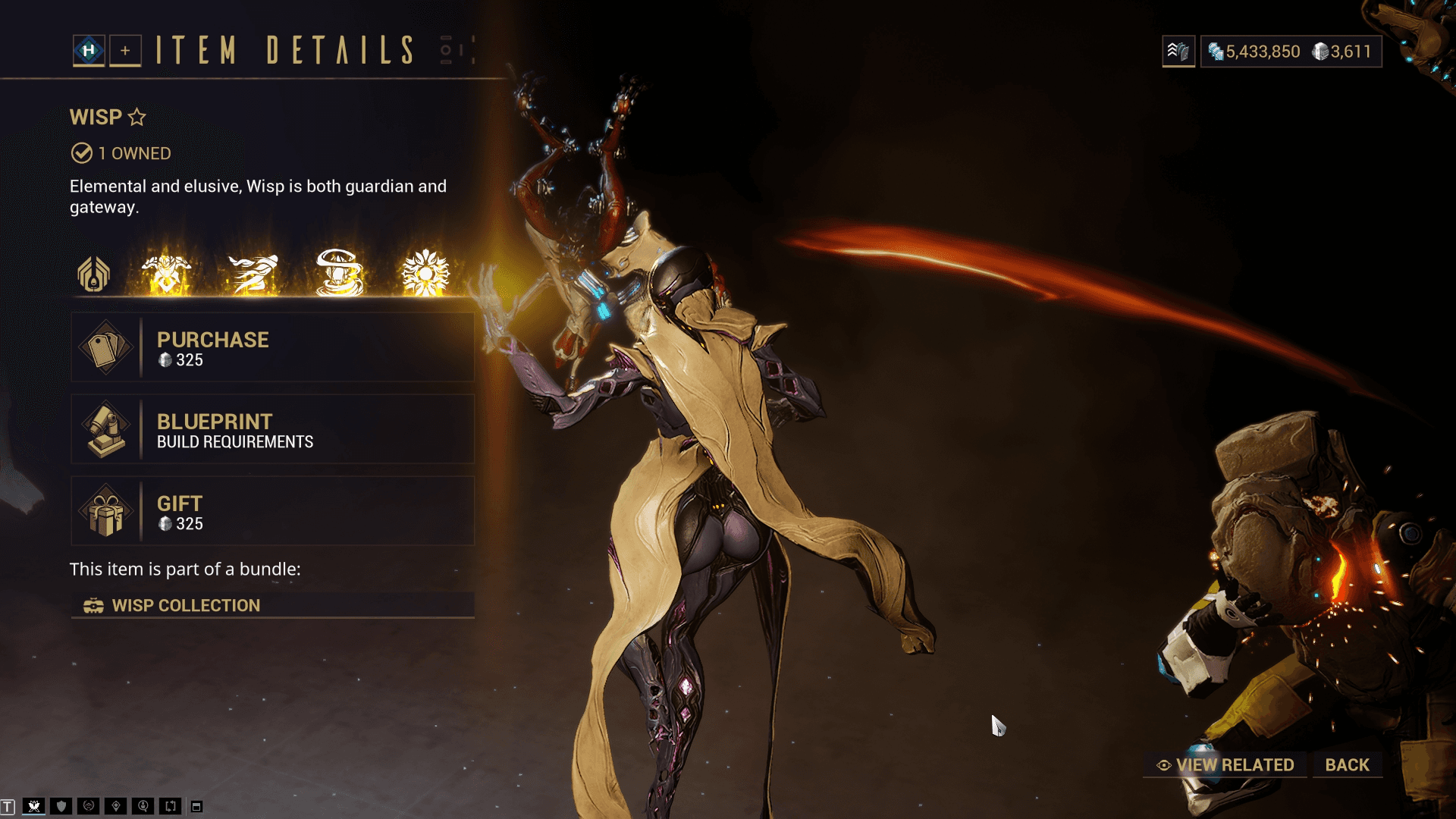
Last iteration I did of the Warframe Screen which brought the text above the buttons and this was then handed over to Kalin on the Team would would take over to match font styling and iconography and items such as bundles and bundle breakdowns, you can see the final version of the UI that is in game at the bottom of the page. She did an absolutely amazing job.
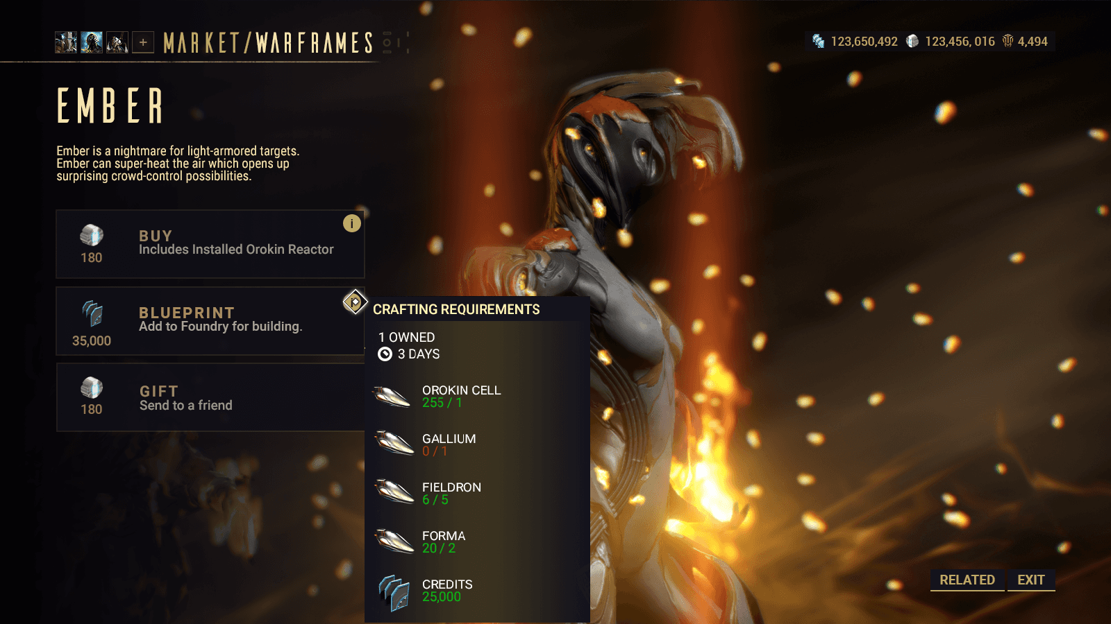
Weapons V1
When the initial warframe screen was designed, I also translated it over to what the weapons would look like. I played with the idea of being able to try the firing animations which I thought might be a cool mechanic that users may try out and incentivize purchasing.
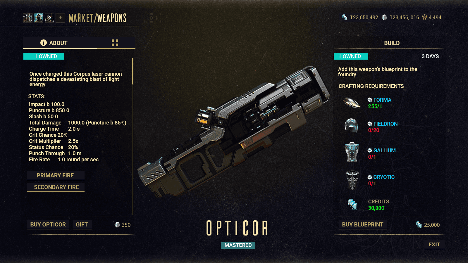
Weapons V2
Here the tabbed window on left was removed just like the warframe screen with the ability to buy / gift on the bottom of the screen.
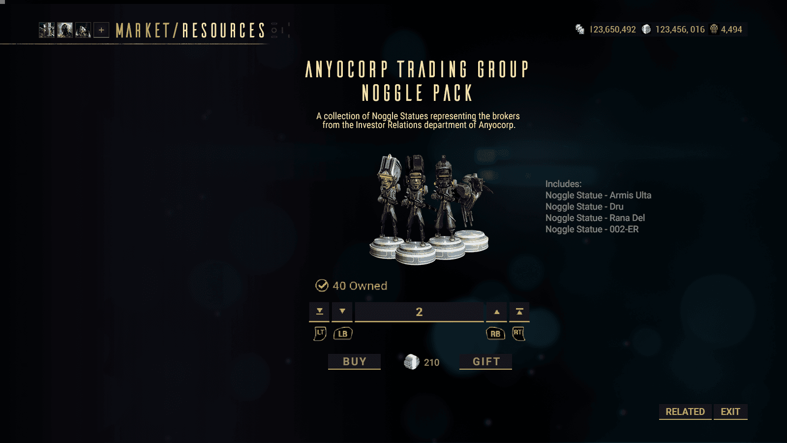
Item Pack V1
Here was the first iteration of bundles UI. The components of the bundle need to be clearly seen, here it follows how the existing item windows looked but with the current UI styling. Console quantity picker was also tested to make sure it would fit on screen.
Item Pack V2
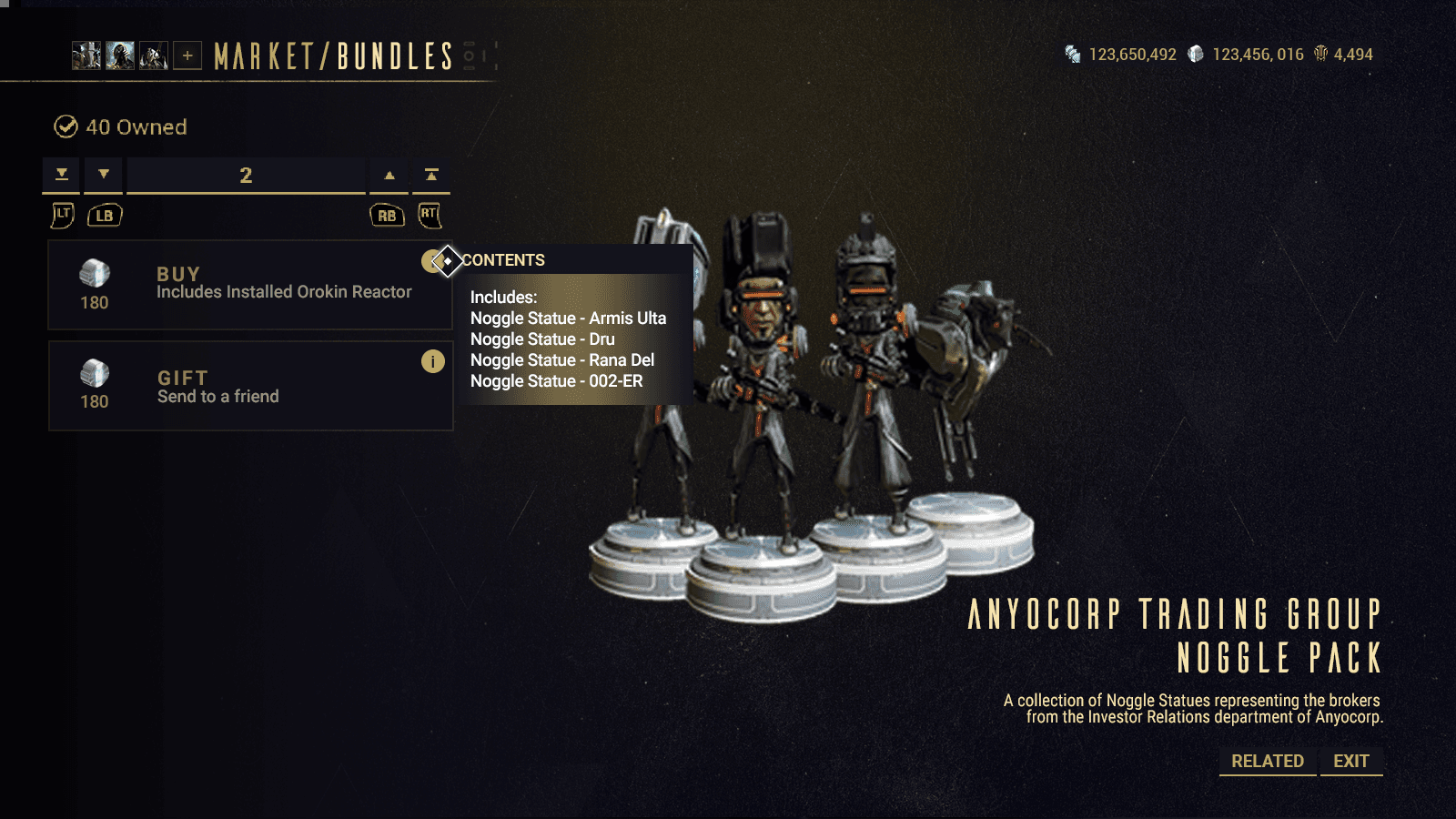
Item Pack V3
As the design for the warframe screen was heading to the final iterations, those changes were mimicked here to see the fit. The issue of item image resolution came up so resizing was needed.

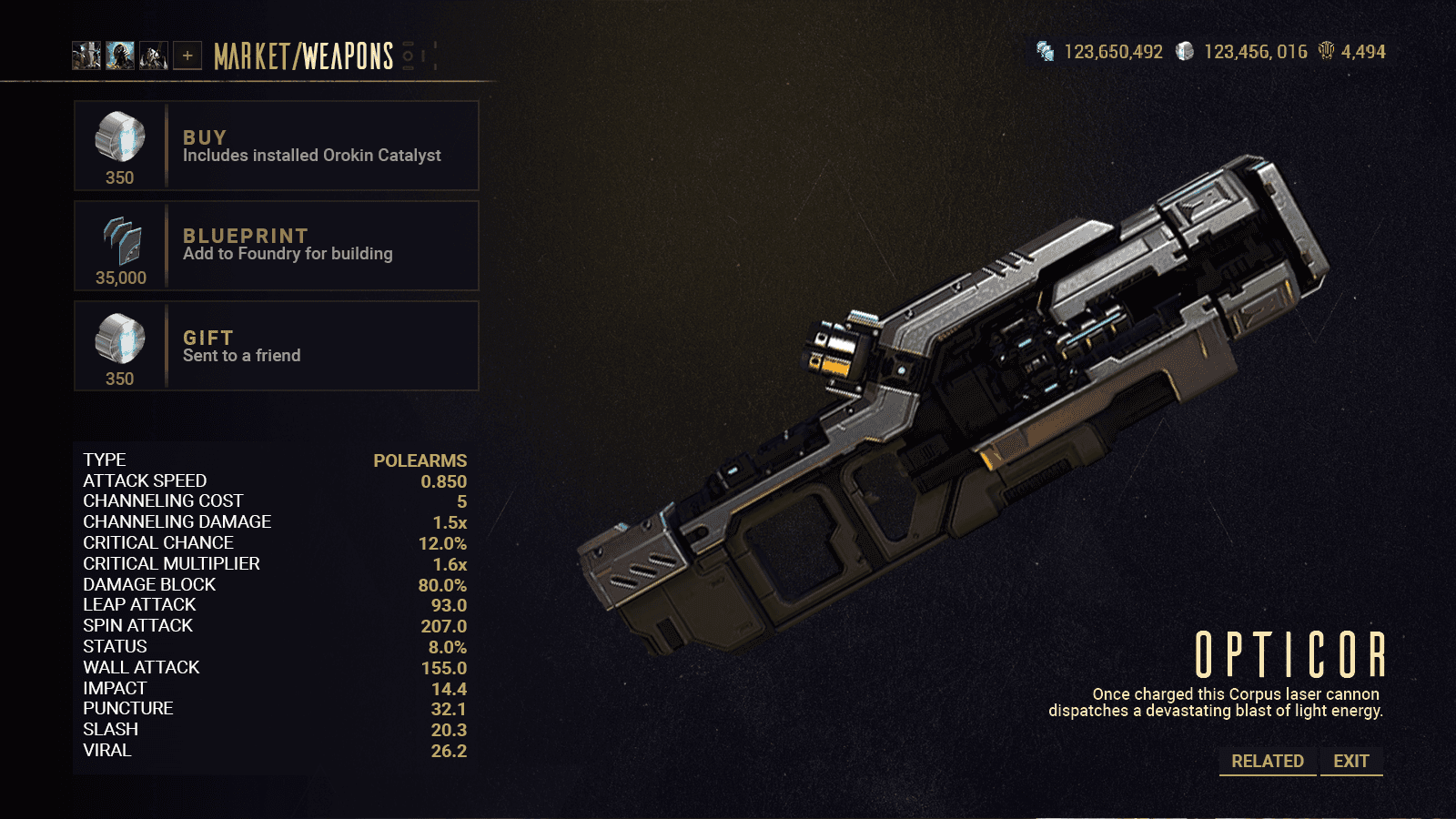
Final version
Here you can see the final version that is currently in game.
The information of the item is cleaned up above the CTAs, and we append relevant bundles that open up in an overlay.
Scope of Work