Warframe Arcane Manager Update
Client
Warframe - Arcane Manager Update
Year
2018
Arcane manager
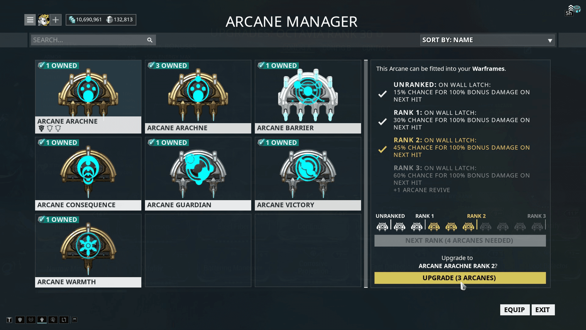
The previous version of the arcane manager that was needing update to the new art style.
The Arcane Manager allows players to upgrade and view their collected arcanes (equippable items that provide conditional buffs). Before starting the designing phase, I looked at the official forums and reddit to see any problems players were having with the current version. Leveling requirements were the main problem for the UI and was the primary focus of the redesign.
Arcane Selection V1
Here the arcane screen is made closer to the inventory screen style the players are familiar with. The grid has increased to 5x4 from 3x3 for quicker scrolling through the inventory.
I overlaid the rank of the arcane onto the grids to save real estate on the thumbnail.
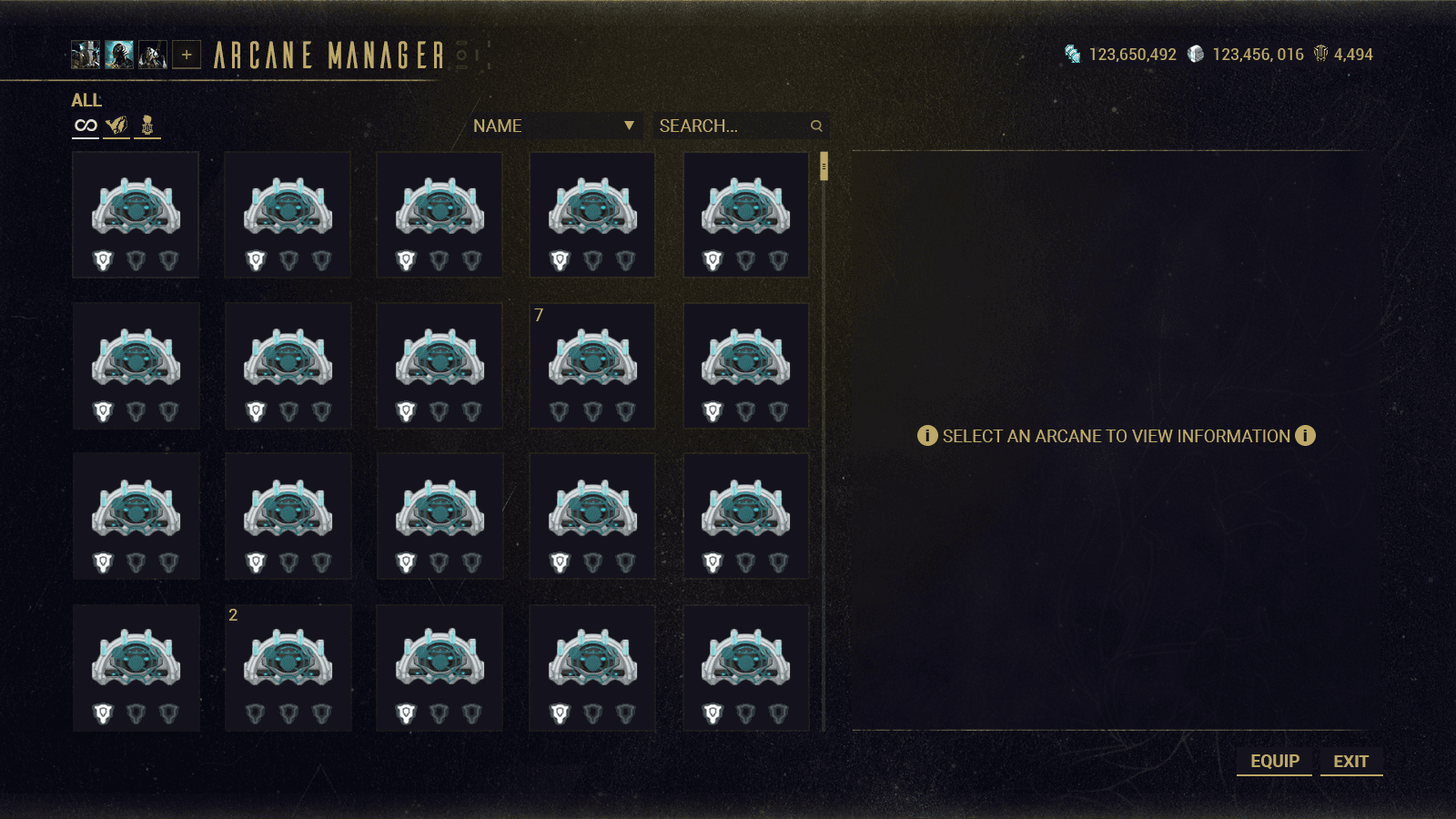
I switched up the layout of the ranking requirements to an inverse pyramid to see whether the hierarchy would be an easier model to show the leveling up. The special button now communicates the requirement to next rank without having to do the two click process that was in the previous version. One button was to confirm you have the amount needed, the second button was to perform the upgrade.

Arcane Selection V2
In this version, I experimented with separating the inventory grid and the detail panel with the arcane visualisation in between. The grid would be reduced to a 4x4 scrolling list to accomodate for the layout.
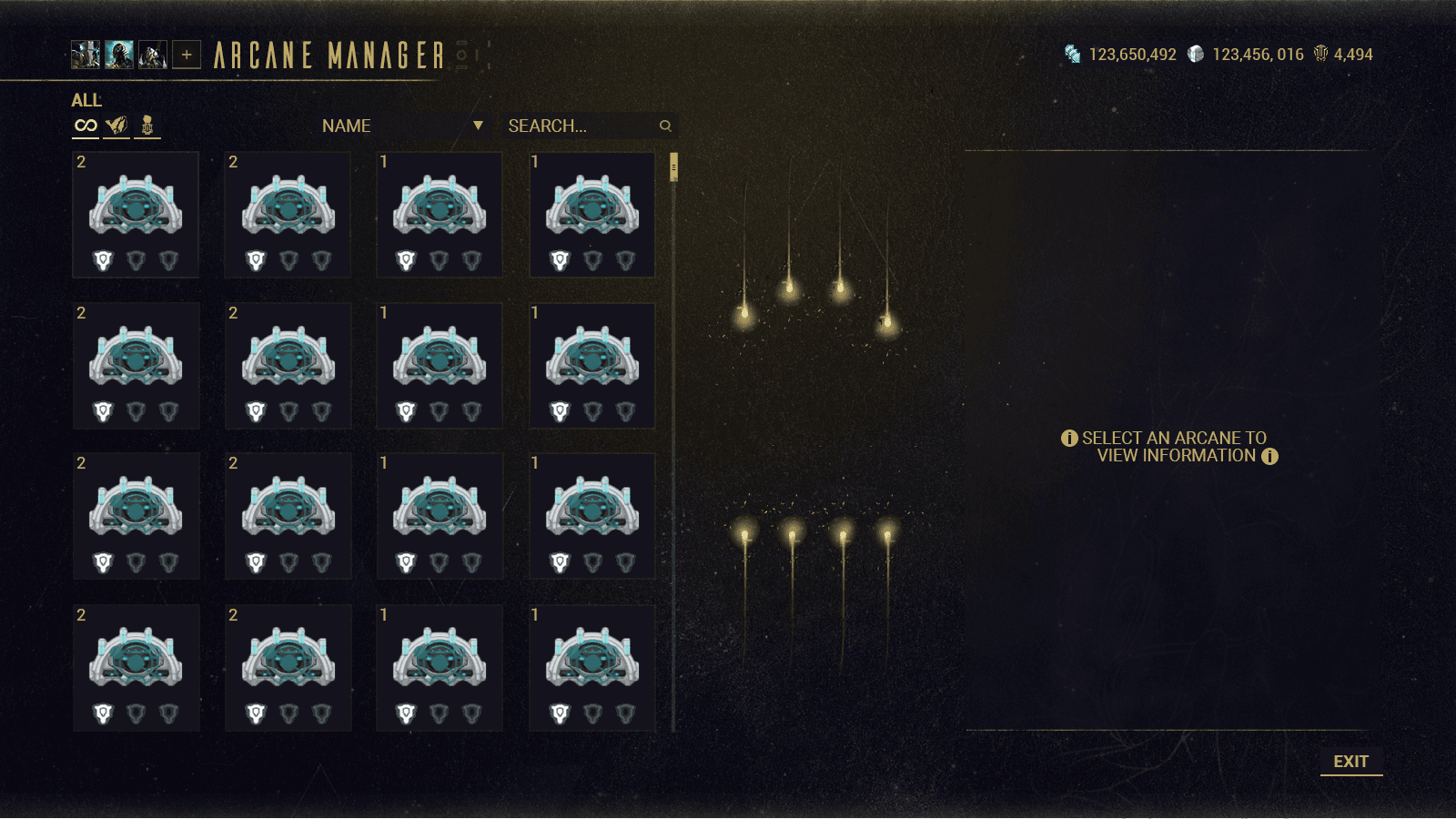

As the arcane image was placed in the middle now, the pyramid feel created a weird feeling of negative space, so I decided to go back to the feel in v1
Arcane Selection V3
For this version, I decided to try a reskin of what was originally in the detail panel to see what it would look like with the new visual style so as not to eliminate a reskin if none of the iterations proved fruitful.

Arcane Selection v4
Here I tried a horizontal pip-style progression meter with the required arcane count being overlayed on the icon and current rank highlighted in the progression meter.

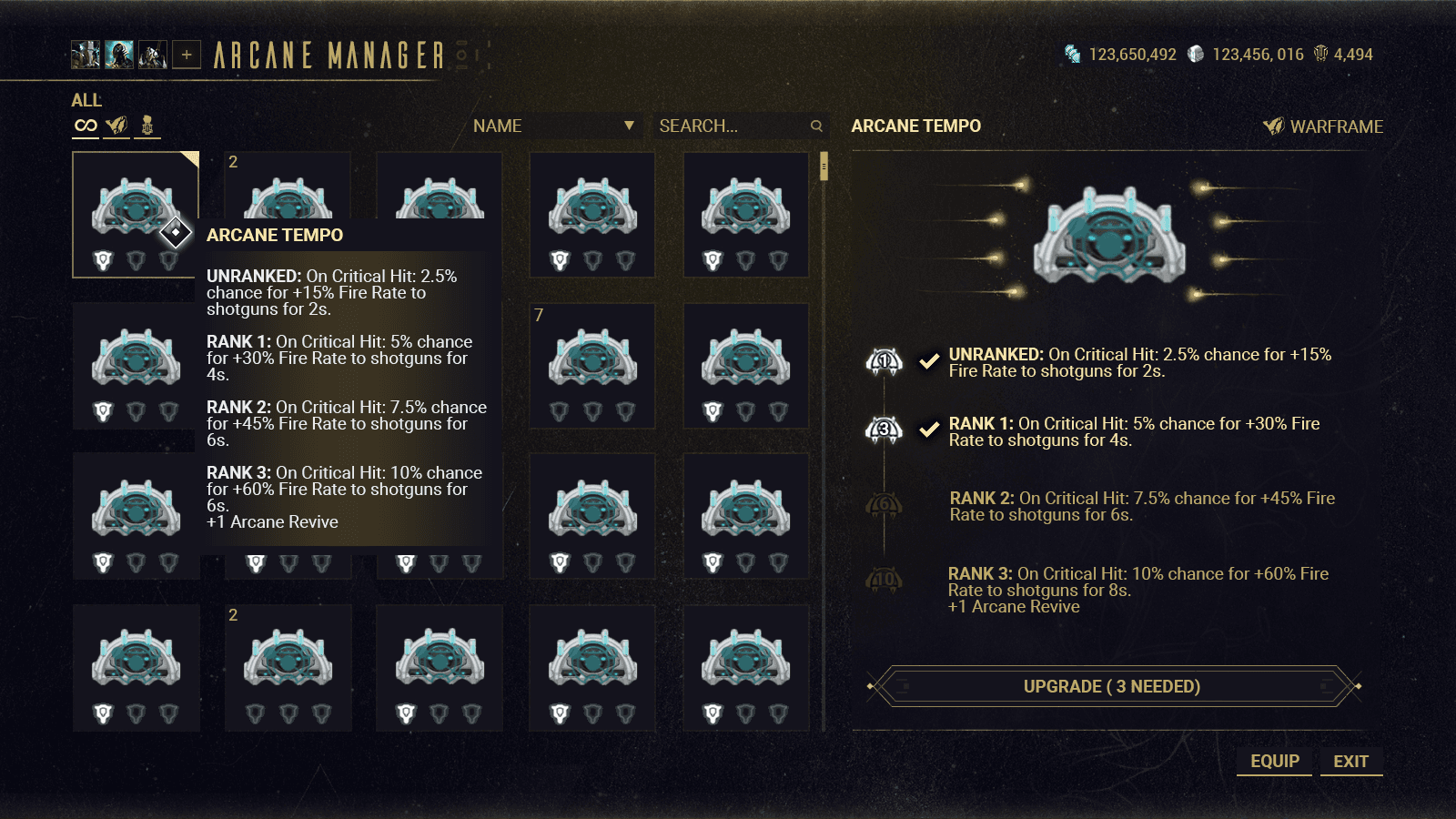
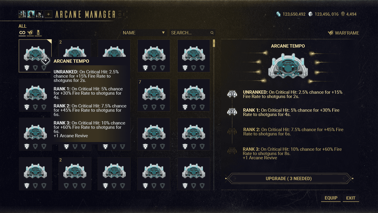
Arcane Selection V5
A vertical pip-style progression meter was the next iteration as the flow of progression leads to the upgrade button as the eyes flow down. The check mark a second visual cue to whats been done before. The visual hierarchy also divides whats left for the player to upgrade.
I removed the check marks in this version to see would the hierarchy be enough and to clean up the amount of iconography used in the detail panel.
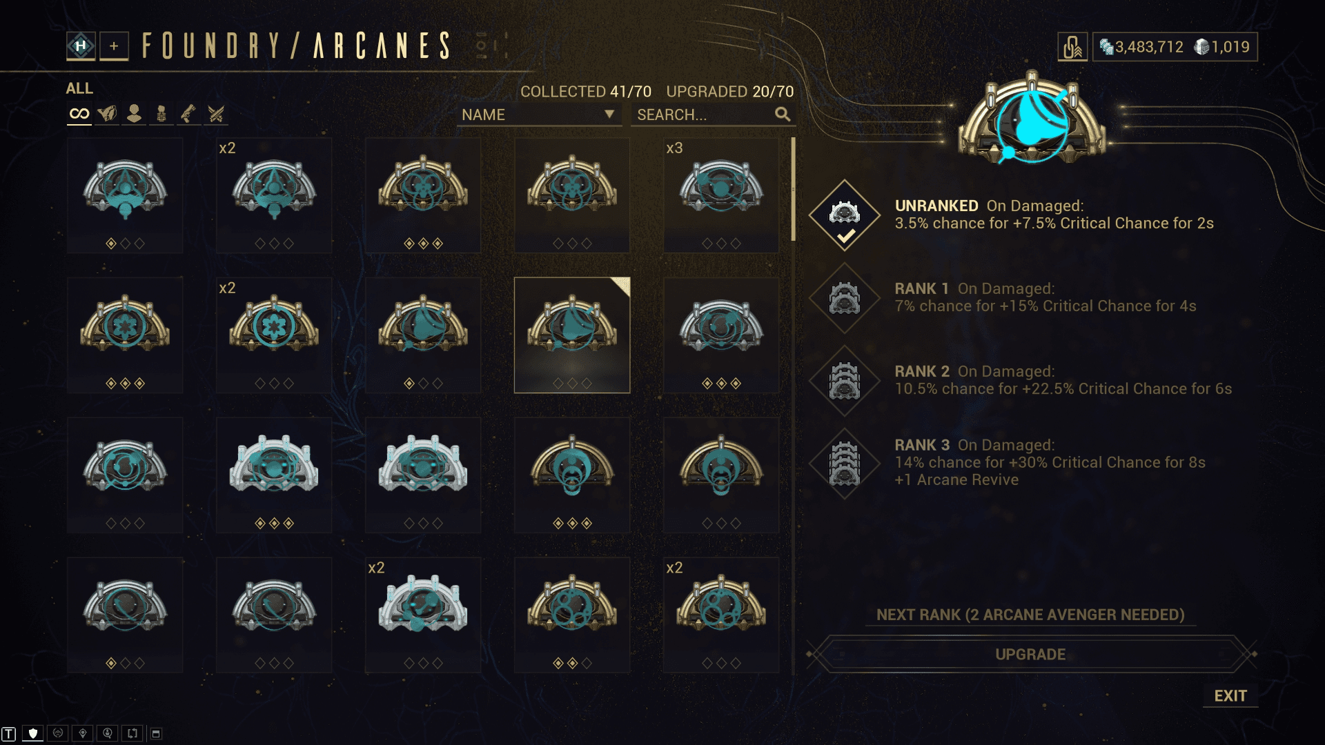
Final version - In Game
Here you can see the final version in the engine, the rank icons were made smaller, and the pips were redesigned by the UI Art team.
Scope of Work

