Redesigning the Candy Profile
Client
Candy Crush Saga - New Player Profile
Year
2025
One of the projects I lead the UX for was the redesign of the old player profile. We wanted to update the visual presentation and provide more meaningful insights for the players."
Scope of Work

The original versus the updated.
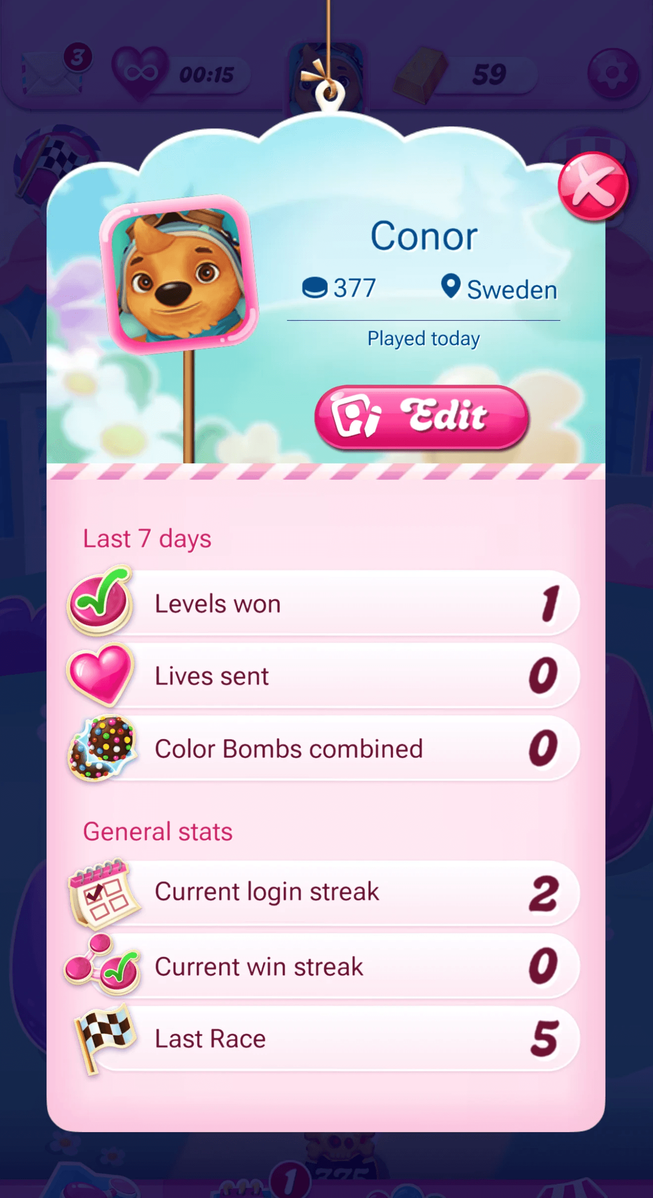
Old
On the left is the older player card. It features information regarding the player's name, location, and last activity. It highlights also the current level they are at and their avatar they have chosen on the king website.
Underneath you can see the stats shown about how they send lives to their friends also this week.
A CTA button is present underneath the profile related to various actions such as add friend, remove friend, accept invite, decline invite etc.
New
The picture on the right shows the new profile.
The layout of personal information is condensed in the top half with more vibrant background to give some personality.
The CTAs are added closer to the information of the player and inside the interface itself.
Now the stats section has been further extended to show more variety of statistics regarding different levels of play.
Tapping a stat will show an explanation to what they stand for
Why?
The main reason the layout of this screen was updated was to prepare for stats that likely would grow over time. Hence the categorization and generous text allowances for the cells. We support many many languages in Candy Crush Saga so we have to make sure we can grow up to 150% in text size. The original layout had some issues regarding text size and we wanted to reduce the use of auto sizing where possible.
The addition of tooltips is to help bridge the gap from what might be normal convention in gaming but the userbase in Candy swings towards 30-50 year old casual gamers so we cannot assume they would know what every stat would mean.
This layout was also constructed so that as phone scale vertically, there is room to grow in the future should more functionality be added.
Rewarding and Comparing
Superstats
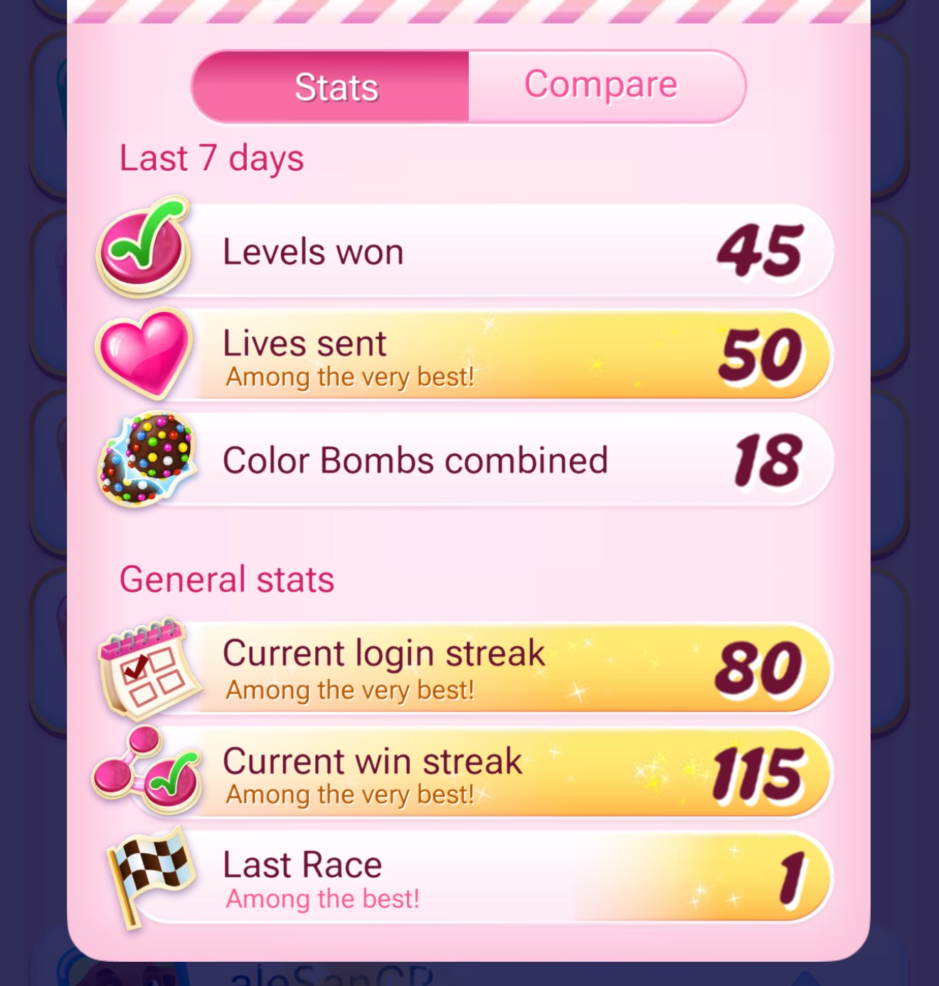
To further motivate players, game design wanted to have states that could highlight upon certain thresholds.
Here we have added a light VFX for threshold one and a much nicer starry effect for threshold two. This is accompanied by text explaining how good the player is. This is particularly interesting when browsing other players profiles and you can instantly see how good they are at a glance.
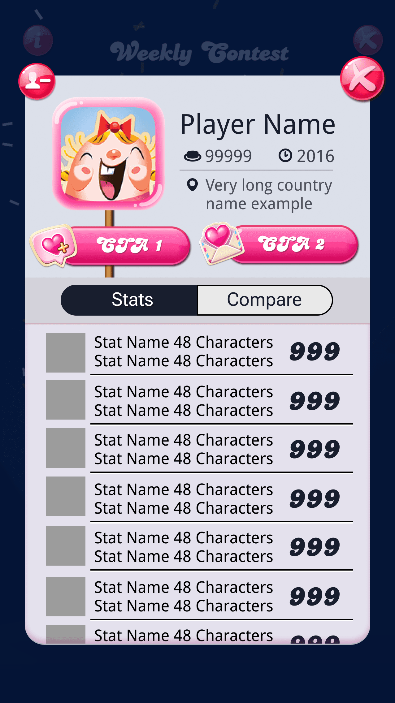
Comparing

This mode for other player's profiles allows you to switch between the main stats and a view against your own stats. Players love to compare with friends and strangers and we even highlight the stats you are better than them in.
This view is particularly popular!
User Testing
I had done multiple rounds of testing in Playtest Cloud to validate early wireframes of this. These wireframes were simple in nature, looking at primarily the flow and multiple use cases of:
Viewing your own card
Viewing a stranger's card
Adding them as a friend
Accepting pending Invites
Viewing a friend's card
Removing as a friend
Sending Lives
Requesting Lives
Other states
Loading
Errors
Setting a name
Overall the flow was simple and performed well but due to the simple nature, it was hard to gauge certain things due to the simple look of the interfaces.
Testing with visuals
Once we had some concepts of the UI from our talented designer Fernando we did a second round of testing and also started testing our copy choices regarding the stats and their tooltips.
This led to tweaks for layout and edits that eventually made it to the final version that is live in the game!
